Case Study
Client Website: Jotería
RESPONSIVE WEBSITE REDESIGN FOR LOCAL SF BUSINESS
Based out of San francisco, Jotería is a game of chance, similar to bingo, that celebrates Mexico’s LGBTQIA+ culture.

ROLE
UX RESEARCHER
UX/UI DESIGNER
SCOPE
MVP WEBSITE
RESPONSIVE DESIGN
TOOLS
FIGMA
ATTENTION INSIGHT
FLUX
Duration
80 HOURS
Problem Statement
Users interested in purchasing a game from the Jotería website need to be able to quickly identify the product and have a smooth experience throughout the checkout process in order to feel satisfied.
Solution
The website redesign focuses on consistent branding, clear product information and game play instructions, so that users from various entry points have a smooth experience when purchasing the game.
Overview
Similar to bingo, Jotería is an out, loud and proud board game that celebrates Mexico’s Lesbian, Gay, Bi, Trans and Queer culture. The game Jotería is based on a culturally significant Mexican game called Lotería. A deck of 54 cards with culturally relevant words are called out one-by-one. Players select an individual game board and similar to bingo, a winner is declared after filling your game card. Jotería builds on this concept and adds an educational component that is full of Mexican folklore, LGBTQIA+ history, romance, and community . Jotería is not just a sensational board game, it is a powerful learning tool that empowers the latine community to reclaim traditionally offensive terms, based on historical research. A second edition of the game has recently launched and it is crucial that the website’s design is responsive for users who want to purchase the game online on various devices.
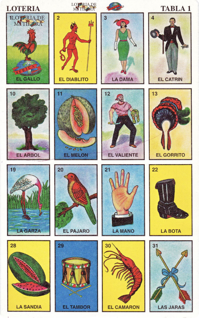
What is the traditional Lotería game?
10 different game boards

Deck of 54 cards

Just some of the ways to win

Other Lotería inspired games
Millennial Lotería

Selena Lotería

Felix d’Eon Lotería

Mission Lotería (SF)


1. RESEARCH
2. DEFINE
3. DESIGN
4. TEST

RESEARCH
Componets
COMPETITIVE ANALYSIS
CLIENT INTERVIEWS
USER INTERVIEWS
Research Goals
I want to know more about competitors who sell in the game market.
I want to understand the participants’ feelings about the current website.
I want to have a deep understanding of the clients goals.
Competitive Analysis
Before meeting with the client, I wanted to have an understanding of the competitors who sell online and sell their products in brick-and-mortar shops.
I began by doing a google search and found smaller projects like “Gay Lotería” and “Queer Lotería”, but they were sold through Etsy with no stand alone website.
I was able to identify “Millennial Lotería” as a successful game sold online and at Target.
I included Caddis Eyewear in my research because of its local brick-and-mortar model.
Client Interview
I met with the client to deepen my understanding of his goals for the jotería and the website. It was helpful to hear his needs to help me deepen my understanding of his goals.
A key takeaway from the client interview was that the current website was not in-line with the client’s main goal of making a profit and selling 2,500 units. The website layout and Spanish language format caused confusion during my user interviews and would be a friction point towards a potential sale.
User Interviews
Next, it was important to gather insights on the users’ perception for the existing website.
3 participants form the target audience of 25-35 years old
Included self identifying as male and female.
Two gay males and one straight female participated in in-person interviews.
Questions focused on their overall feelings about the current website, product identification and branding.
Existing Website
User Interview Findings
3 Participants 25-35 years old

Finding #1
3 out of 3
Participants could not identify the game as the main product on the landing page because of too much information.
Finding #2
3 out of 3
Participants felt there was too much text and preferred a shorter bio because they don’t want to read that much text.
Finding #3
3 out of 3
Participants liked the checkout process because it was simple, clear and consistent with other checkouts.
Finding #4
3 out of 3
Participants noticed inconsistencies in branding elements like font, colors and images during the interview.


2. DEFINE
1. RESEARCH
Define
4. TEST
3. DESIGN

Componets
COMPARING GOALS
PERSONAS
TASK FLOWS
Comparing Goals
Overlap
After gathering information from the client, users and taking into consideration the business goals, the need for an intuitive website that takes into consideration the needs of users coming from different entry points in regards to cultural and language backgrounds was needed.
Branding
Inconsistencies in branding across the website and product packaging was an important focal point that needed to be addressed. Users noticed the inconsistencies and the client indicated a need for it to be consistent with existing supply of printed games.
Printed Logo

Web Logo Variation 1

Web Logo Variation 2

Web Logo Variation 3

Working within the constraint of the existing printed black logo and not having access to the original typeface I went with a script typeface called Birthstone that was very similar to the existing print.
Although I explored other color options, I settled on the existing black color palette to let the pink games (product) stand out and not over saturate with branding colors.
Establishing Consistency

Branding Colors

Personas
I began to define who the target audience was based on the client interview and market research. This resulted in two personas who represent the target users.
Click to Enlarge
Daniel
Part of the LQBTQIA+ community
Speaks Spanish & English fluently
A local who is more likely to use the website to buy a game online.
Click to Enlarge
Stephanie
Ally of LQBTQIA+ community
Non-Spanish speaker
Likes to shop locally and tends to avoid online shopping.
I’ve created two task flows to guide my design and to test during my usability testing.
TASK FLOWS
Task Flow #1
The 1st task flow targets users who purchase a game online.
Task Flow #2
The 2nd task is the store locator feature for brick-and-mortar shoppers.


2. DEFINE
1. RESEARCH
3. DESIGN
4. TEST

Design
Componets
HI-FI WIREFRAMES
LO-FI WIREFRAMES
BRANDING
Design
Now that I had a clear understanding of the client’s goal, users’ insights and targeted audience, I began to draft wireframes that addressed the users desire of clear product information, consistent branding and smooth checkout. Addressing these points simultaneously helps the clients goal of a happy user who makes a purchase.
Wire Frames
Landing Page
LO-FI Wire Frames
2
3
4
5
1
HI-FI Wire Frames
2
3
4
5
1
Landing Page Key Features
Clear Navigation
Users indicated a need for consistency throughout the website
Prominent CTA that reinforces the client’s goal of selling more units.
Informative Section for users unfamiliar with the traditional Mexican game of Lotería
Customer Reviews
Product Details Page
LO-FI Wire Frames
2
1
3
HI-FI Wire Frames
2
1
3
Straightforward Navigation
Consistent Branding
Users indicated a need for detailed, but clear product information to feel confident in their purchase.
Store Locator
Product Details Key Features
LO-FI Wire Frames
1
2
3
HI-FI Wire Frames
1
2
3
GPS or ZIP Code store locator for users who don’t shop online. The client also stated the goal of stocking local businesses with his game.
Map of locations with store details and navigation directions.
Locations Listed by distance to the user.
Store Locator Key Features
Additional Wire Frames
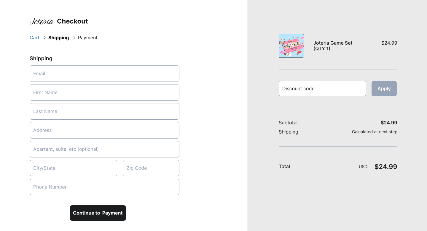
Shopping Cart
Shipping
Payment
Confirmation


2. DEFINE
1. RESEARCH
3. DESIGN
4. TEST

Test
Componets
USABILITY TESTING
ITERATIONS
Heat Map
I obtained more feedback using an AI heat map from Attention Insight that shows where users are looking at and what design elements keep their attention. Additionally, A high fidelity prototype was used in an unmoderated usability test though Flux UX App. These tests helped gather additional information to improve my design.

67%
Optimal Clarity
Clarity Score shows how clear the design is for a new user, whether it is overloaded with elements and clashing colors or clean and clear.
Severe Difficulty (0-29)
Moderate Difficulty (30-59)
Optimal Clarity (60-94)
Too Simple (95-100)
Developing A high fidelity prototype for the website was enjoyable because of the clear insights I developed from the research phase guided my design.
Usability Testing
Usability testing was used in an unmoderated usability test on the Flux UX App. These tests were crucial in obtaining more information to improve my design.
Methodology
7 participants completed an unmoderated usability test on the Flux platform with a High-Fidelity Prototype.
Participants
Key Usability Findings
Branding and Visuals
88% of participants felt very satisfied/somewhat satisfied with Branding/Visuals.
This a huge improvement from our initial interview that indicated 3/3 participants were dissatisfied with consistency in branding and visuals.
Product Identification
86% of participants were able to identify the product being sold as a game with LGBTQIA+ or Mexican influence.
Initial interviews indicated 3/3 users were not clear what the main product being sold was on the landing page.
Iterartions

Version 1
Store Finder Feedback
Participant Comment:
“It took me a bit to find the tab for "find the store" as I thought it would somehow be under "shop" So I looked there first.

Iteration
Solution
Adding a secondary button to the design gives the user a choice to find a store or purchase online. The addition of the secondary button will help different types of users find their path.

Version 1
Checkout Feedback
Participant Comment:
“There is no "back" button to return back to the home page and keep the item in the cart.”

Iteration
Solution
Adding a back button, which is something users are used to, is a more clear way of giving users the choice to backtrack.
Responsive Design
Reflections
Key Takeaway
Overall, This project emphasized for me the need to identify the overlap between the client and user to ensure that the website is not only visually appealing but also user-friendly and effective in achieving the clients goals. It required me to effectively communicate, compromise, and deepen my understanding of both the business objectives and the target audience. I learned that balancing the client needs and user needs is an ongoing process that requires collaboration, flexibility, and a commitment to creating a website that achieves both business objectives and user satisfaction.